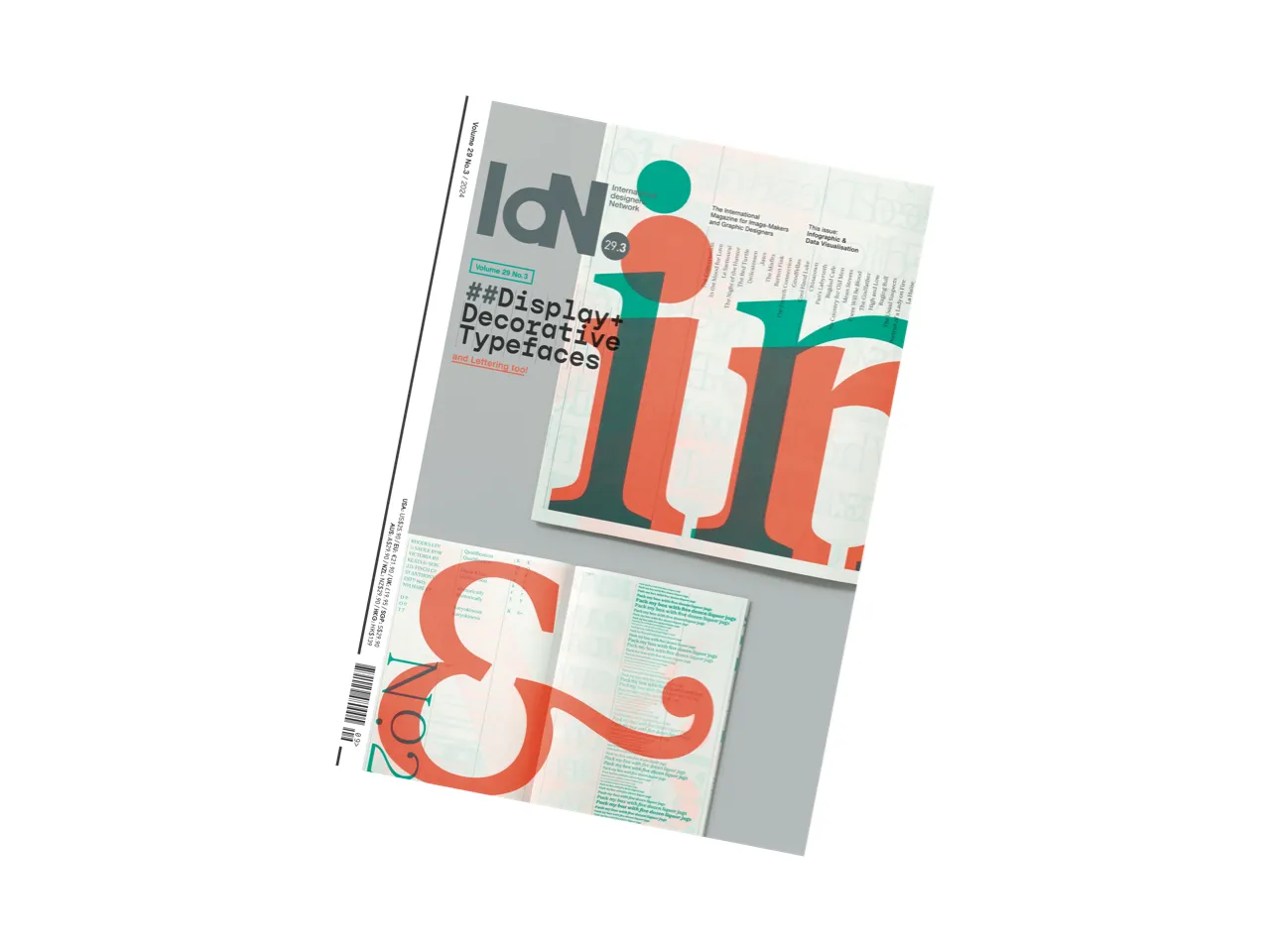
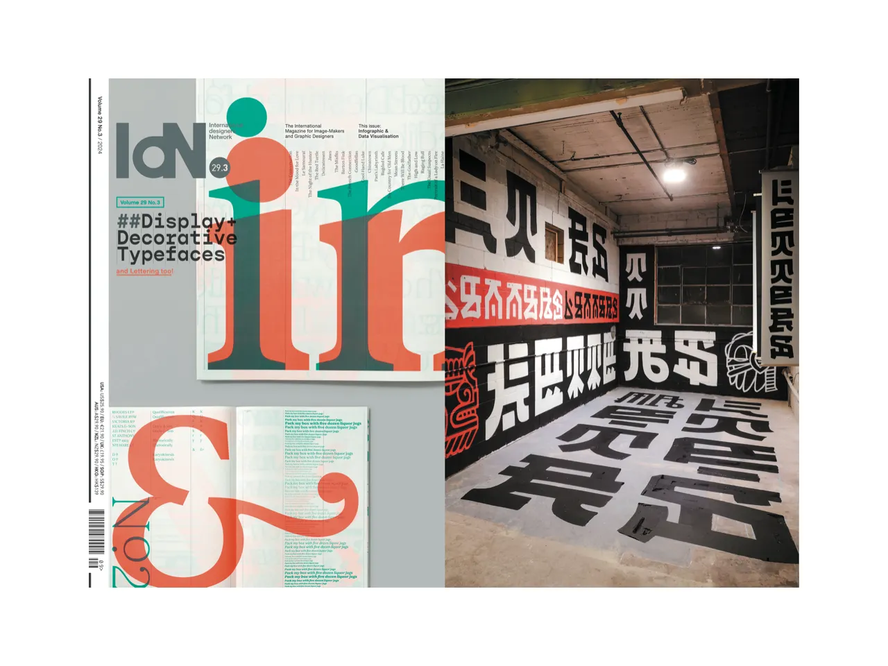
Description
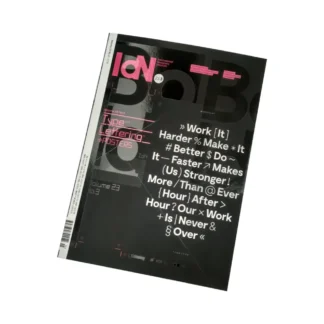
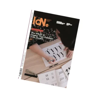
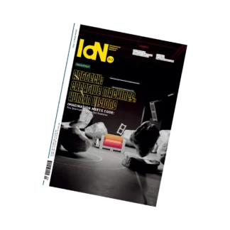
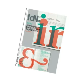
Display + Decorative Typefaces & Lettering Too
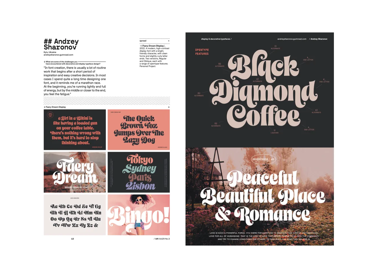
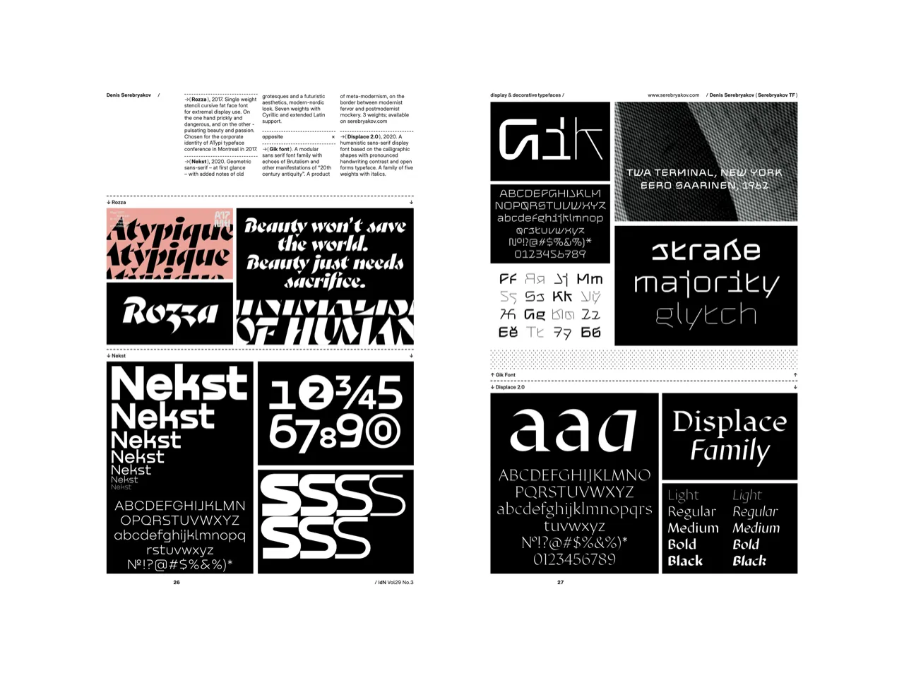
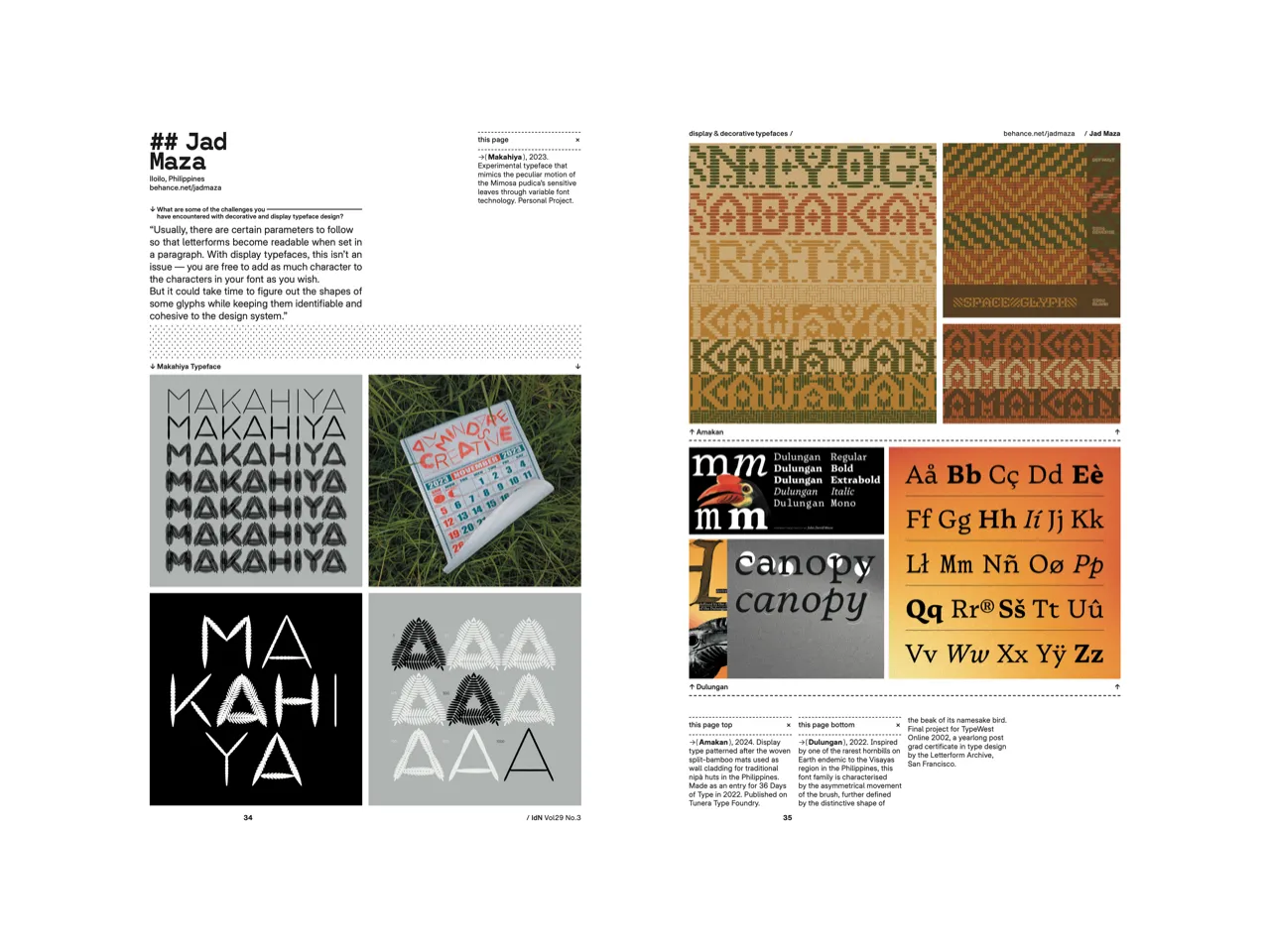
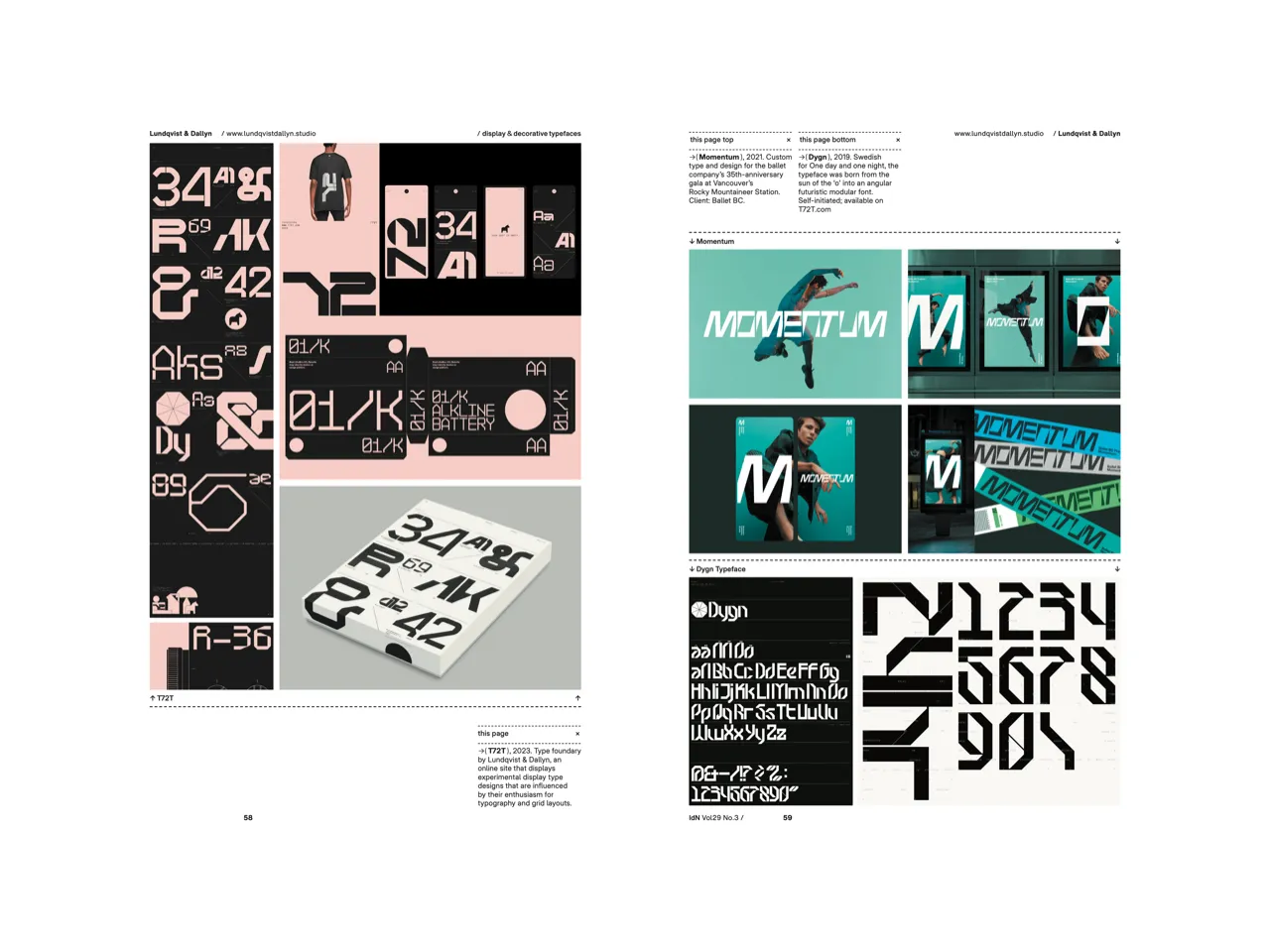
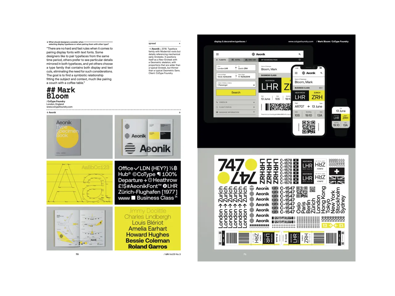
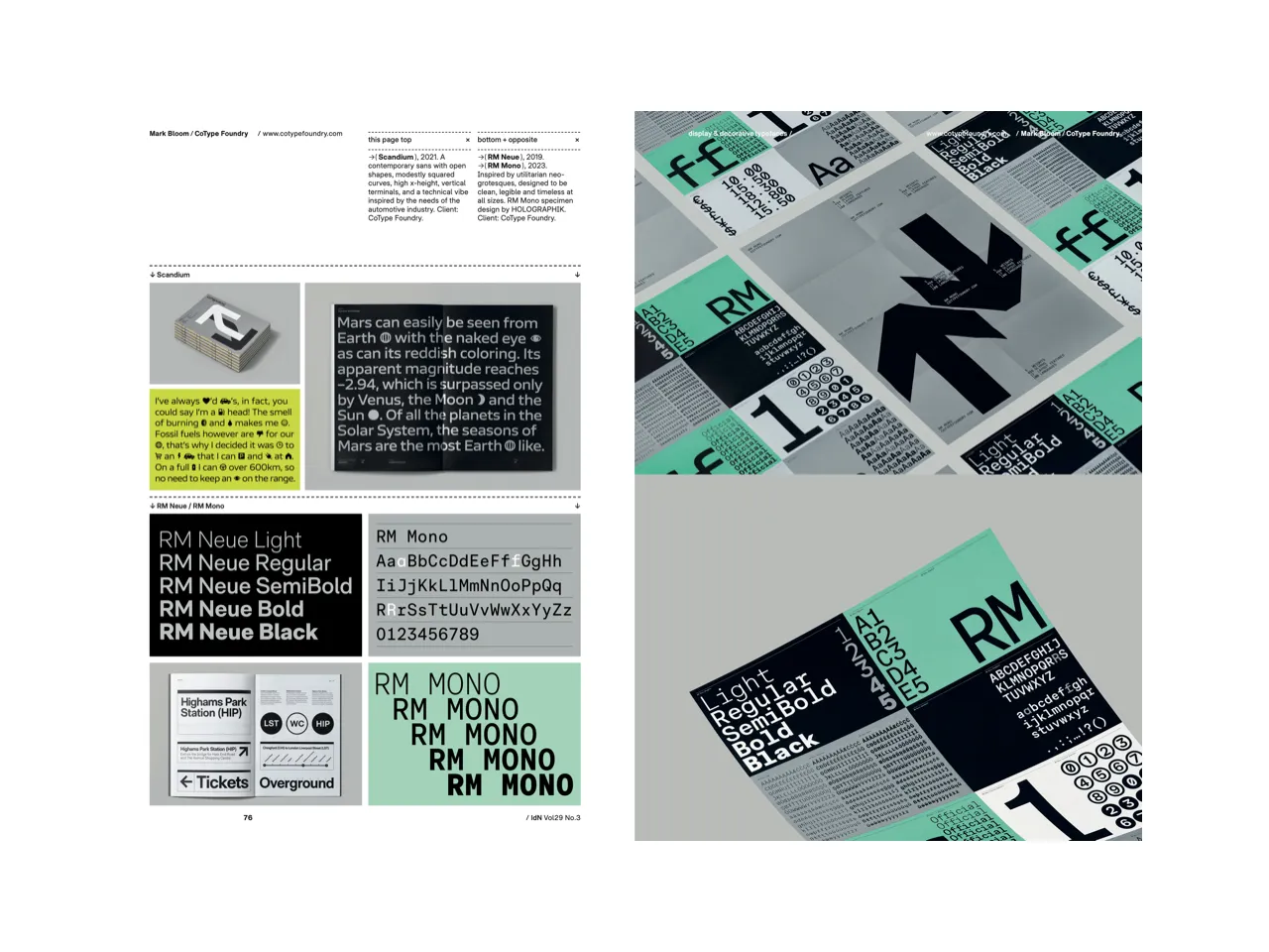
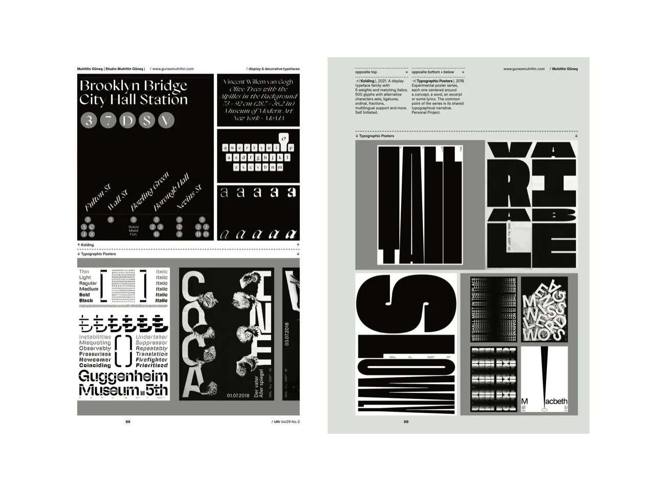
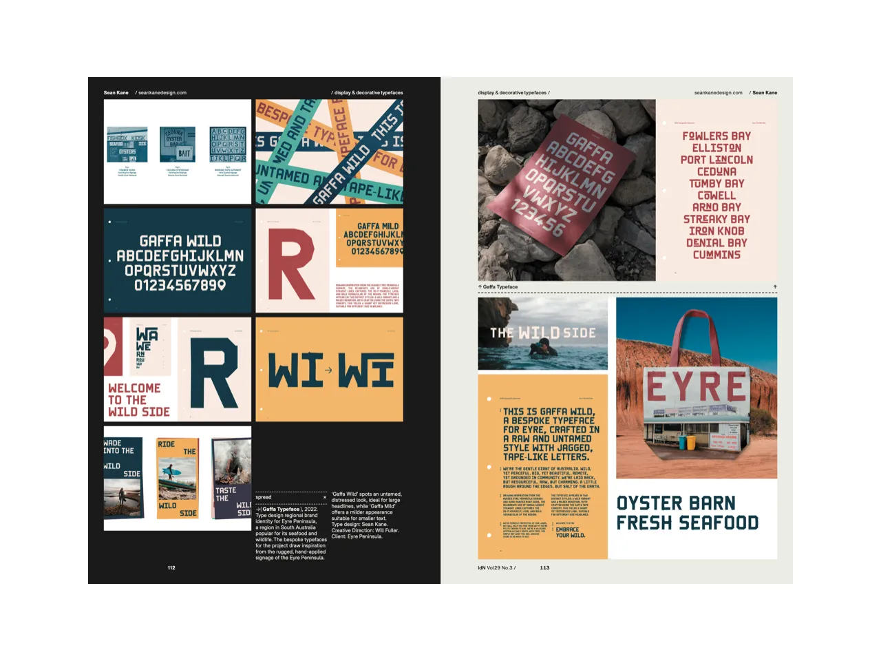
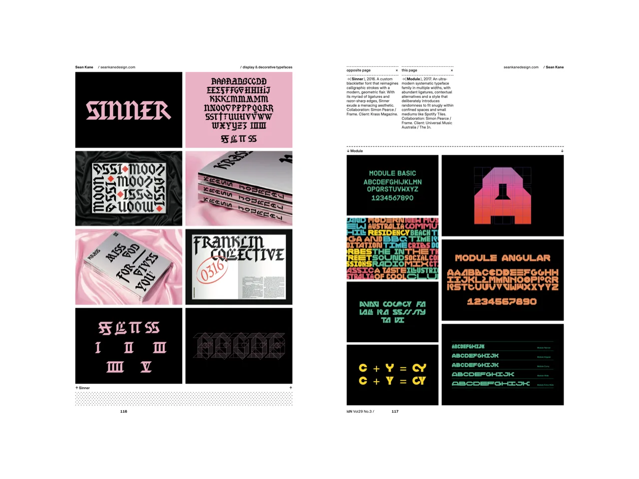
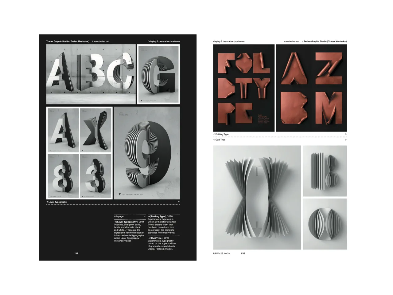
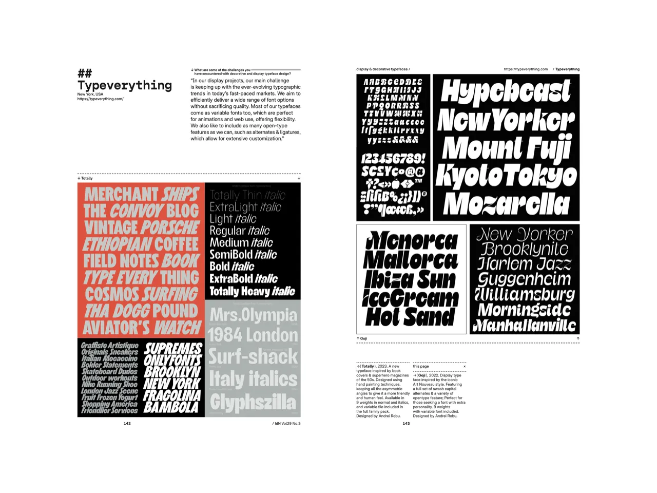
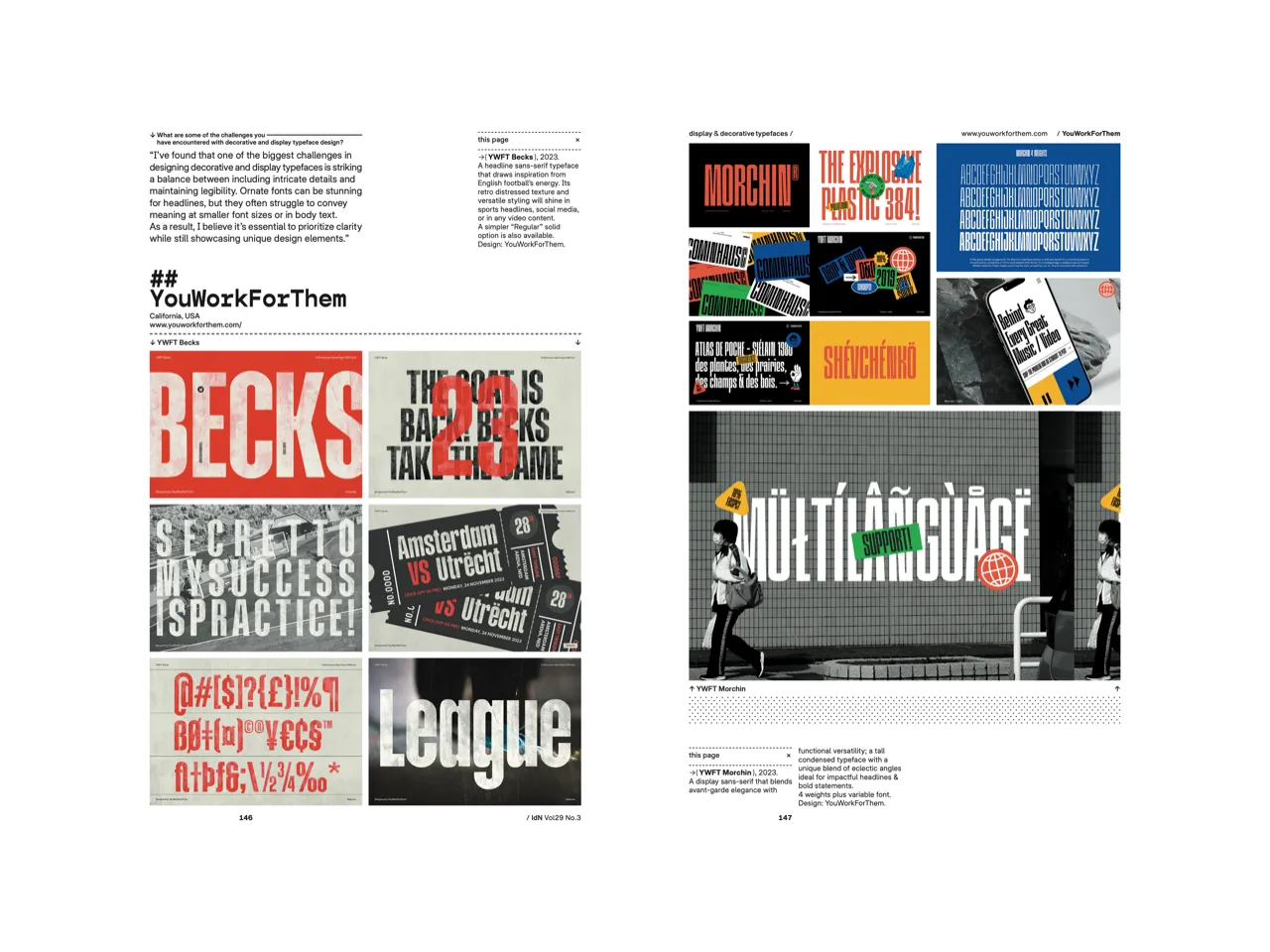
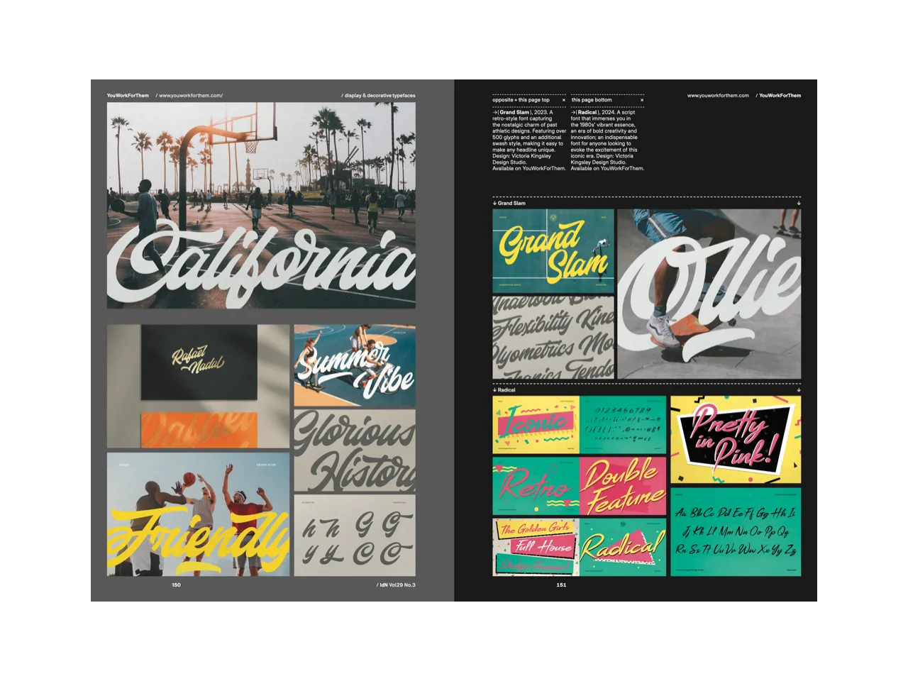
The term “display” in the design world usually refers to large sizes, typically for headlines, titles, signage and other prominent design elements. Display typefaces are therefore often decorative, expressive and intended to make a strong visual impact.
As its name suggests, it separates itself from other kinds of typeface; you would not use decorative and display typefaces in the body copy, but rather as a sub-title, to make a break between paragraphs or highlight some of the main elements that you want to grab attention and make sure that the message is clearly understood by readers.
This is not as easy as it sounds (nothing worth doing in this world is!). So display typeface design should be as bold and eye-catching as possible When a designer is working on it on the computer, they need to imagine and prepare for how it would be like when really displayed in various places, such as billboards, magazines, signage, etc.
Featuring:
0. itemzero | Alberto Romanos (Branding with Type) | Andrey Sharonov | Anna Suvorova (Studio Suvorovaart) | Carmen Nácher | Denis Serebryakov (Serebryakov TF) | Giovanni Stillittano | Hondo Studio | Jad Maza | Jasmina Zornic | João Neves (nevesman) | Kristiana Hristova | Lahis Strobel | Louis Letters | Lundqvist & Dallyn | Mantra Naga Type Foundry | Marcello Della Puppa | Mark Bloom (CoType Foundry) | Mat Voyce | Matheus Mendes (Guasca Studio) | Morgane Vantorre | Muhittin Güneş (Studio Muhittin Güneş) | MuirMcNeil | Paul Bokslag | Redy Studio | Sabina Chipară (Kipara Studio) | Santiago Luna | Sean Kane | Spook DesignCo. (Casper Schutte) | Struvictory.art (Victoria Strukovskaya) | Txaber Graphic Studio (Txaber Mentxaka) | TypeType Foundry | Typeverything | YouWorkForThem
Specifications:
160p + 8p cover
160mm (w) x 230mm (h)
4 varying paper stocks
4C process + matt lamination
ISSN (English Edition): 1029 4805
ISSN (Chinese Edition): 1029 4813

