Description
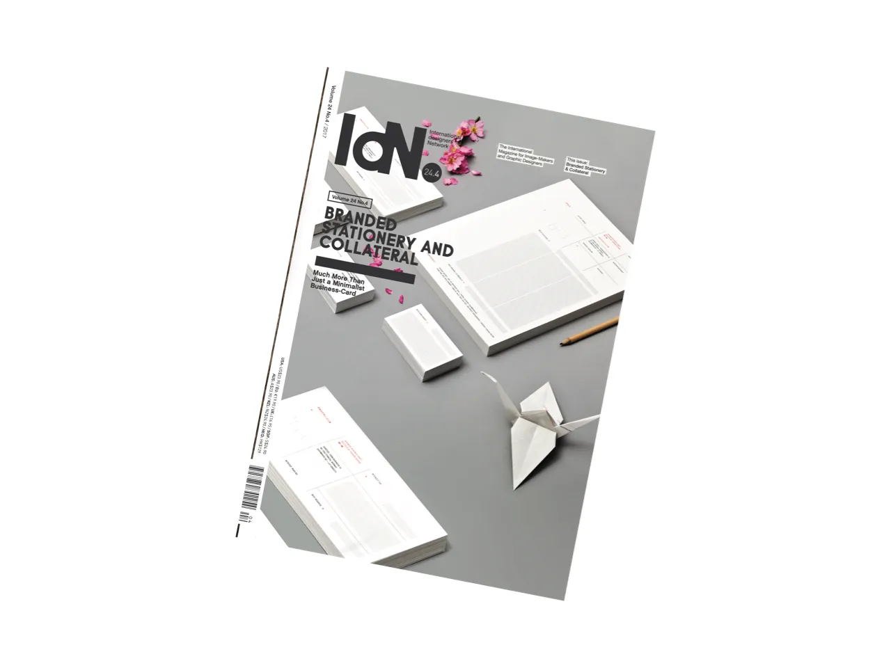
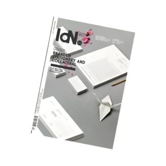
Branded Stationery & Collateral
This stationery, be it paper and writing materials, note pads, envelopes, letterheads or, crucially, name-cards, is on the front-line of the battle to impose an attractive image, to make a memorable impact. But for it to become part of a brand, it must have a consistent theme that conveys the look and feel of the major message meant to be imparted. Every brand’s artefacts should add value to an overall concept by expanding its emotional territory.
The role of “stationery” has therefore been inexorably widened—to include identity-based collateral such as promotional items, T-shirts, smartphone cases, coffee mugs, mouse pads, cardboard tubes, USB devices and so forth. They all serve to imprint an image, reminding recipients of what you stand for or simply that you still exist. However strikingly minimalist its message, a simple name-card alone just doesn’t cut it any more.
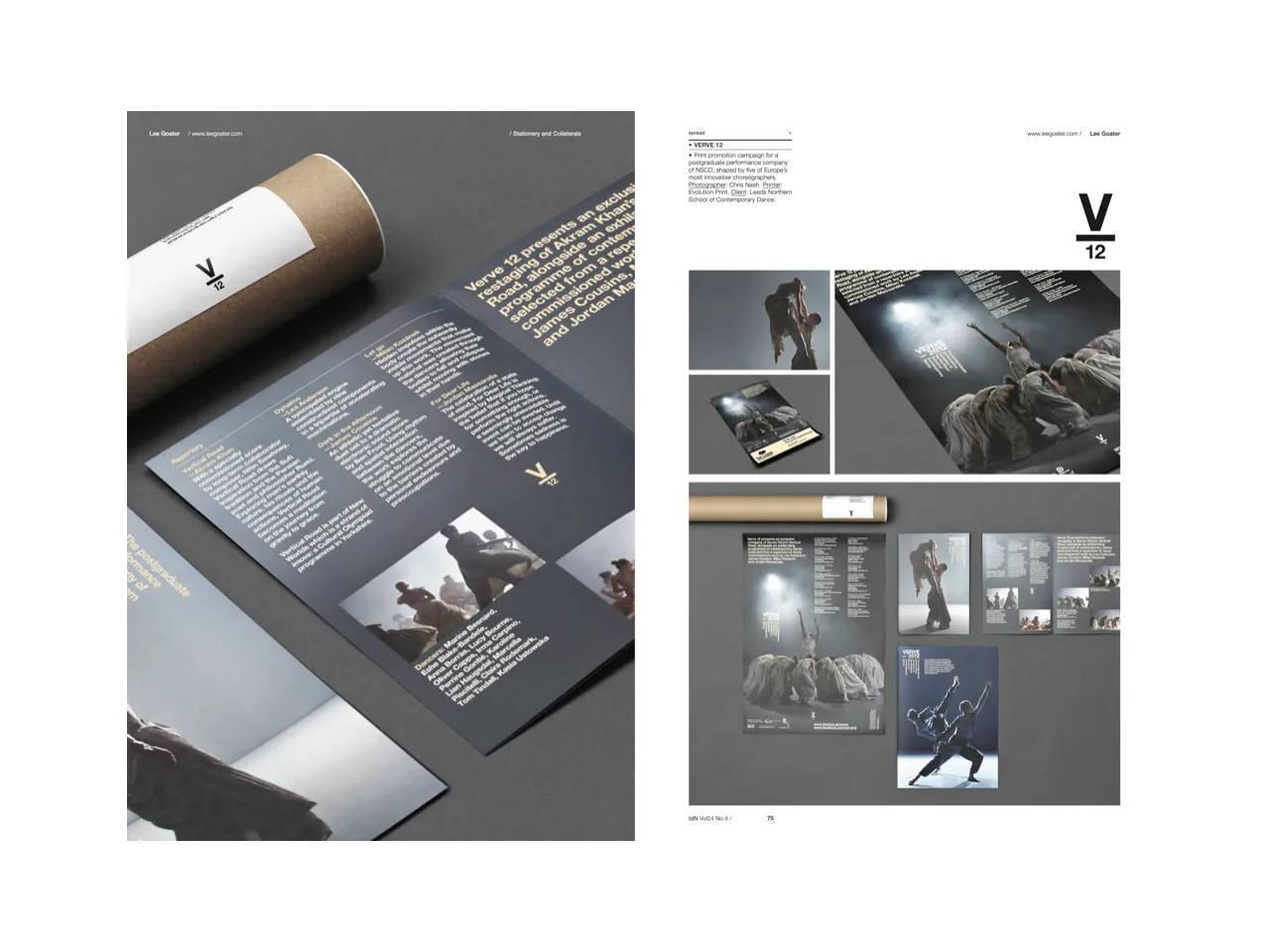
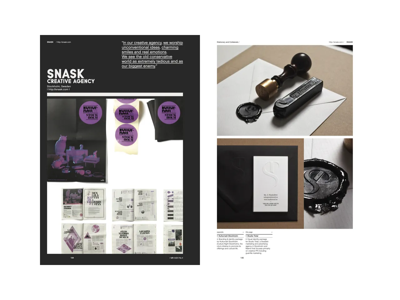
In this issue, we have talked to 38 creatives who have designed stationery for their own and other companies. Since it is something you will almost certainly have done—and will have to do again—we think you’ll find both their comments and their work inspiring.
Featuring:
ACRE | ATMO Design Studio & FELD | Bond Agency | Build | Dschwen LLC | Deutsche & Japaner | Established | Fabian de Lange | Foreign Policy | Grid London | I Depend On Me | The Clocksmiths | Kokoro & Moi | Kollor | Lee Goater | Leo Vinkovic | Lundgren+Lindqvist | Futura | Marco Oggian | Marnich Associates | Kissmiklos | Moodley Brand Identity | Talmor & Talmor & Talmor | Necon Agency | Derek Kim | Noeeko | John Barton | Passport | Raewyn Brandon | Sagmeister & Walsh | Sciencewerk | Silent Partner | Snask Creative Agency | Sunny At Sea | Tatabi Studio | This is Pacifica | Touch Branding | Tres Tipos Gráficos
Specifications:
160p + 8p cover
160mm (w) x 230mm (h)
4 varying paper stocks
4C process + matt lamination
ISSN (English Edition): 1029 4805
ISSN (Chinese Edition): 1029 4813
