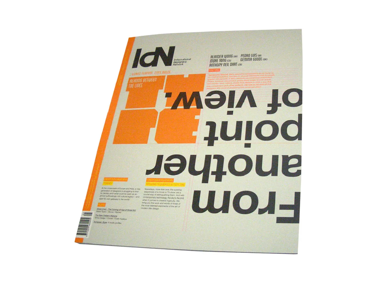
Description
Feature: Typography Special
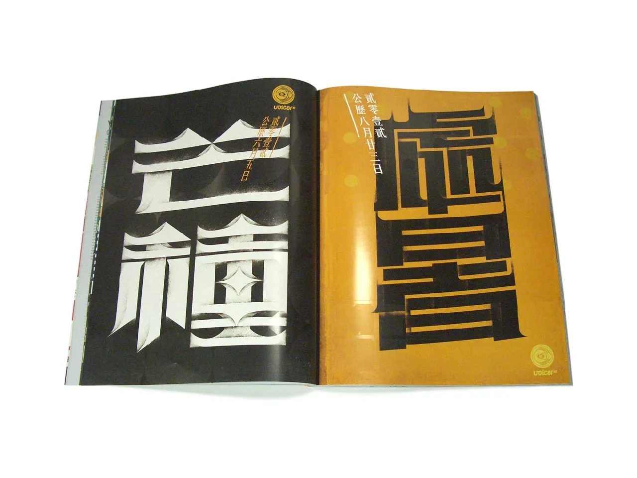
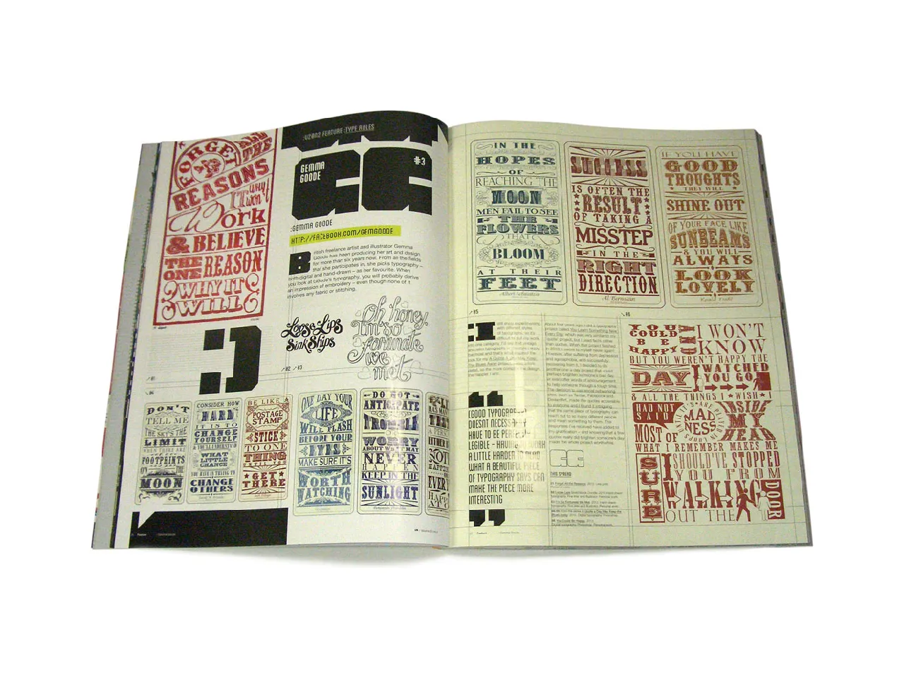
There is pure typography—letter-forms designed to make the biggest, or most original impact—and then what we might term subsidiary or auxiliary typography, one in which the type-faces are specifically chosen or constructed to convey the meaning of the words they spell out, and to integrate seamlessly into the overall design.
In this special feature article, we have asked five leading creatives who have mastered the art of combining words with visuals, and of infusing their alphabets with the “spirit” of the messages they set out to communicate, to explain how they go about their subtle task. And, of course, to demonstrate how they do it.
Featuring:
Alander Wong | More Tong | Pedro Luis | Gemma Goode | Anthony Neil Dart
Contents:
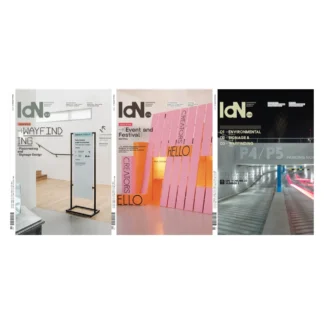
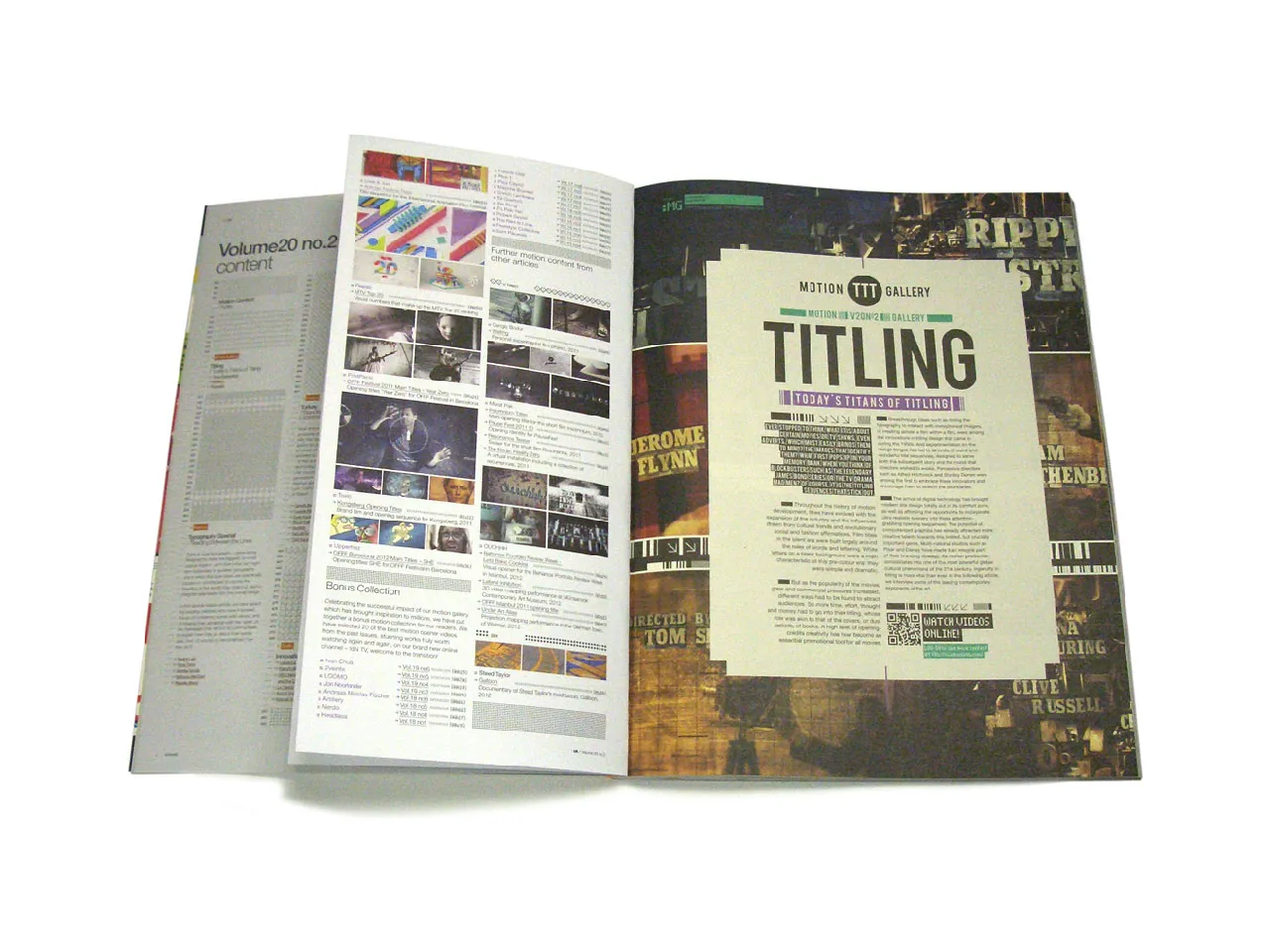
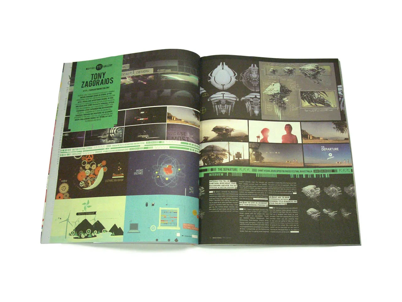
Motion Gallery: Titling
Feature: Typography Special
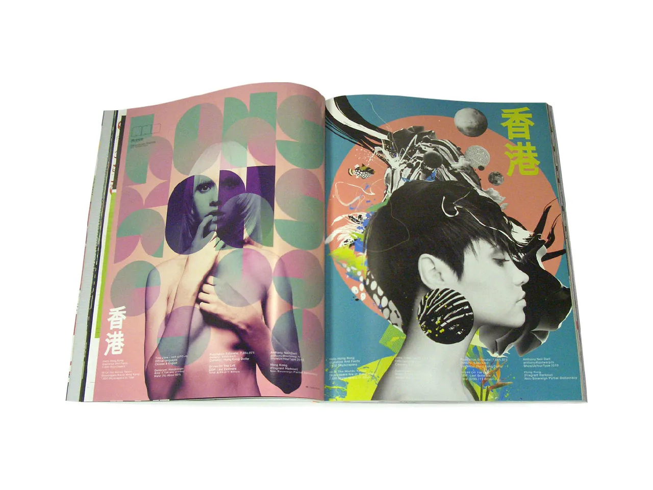
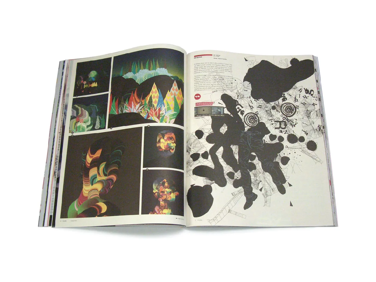
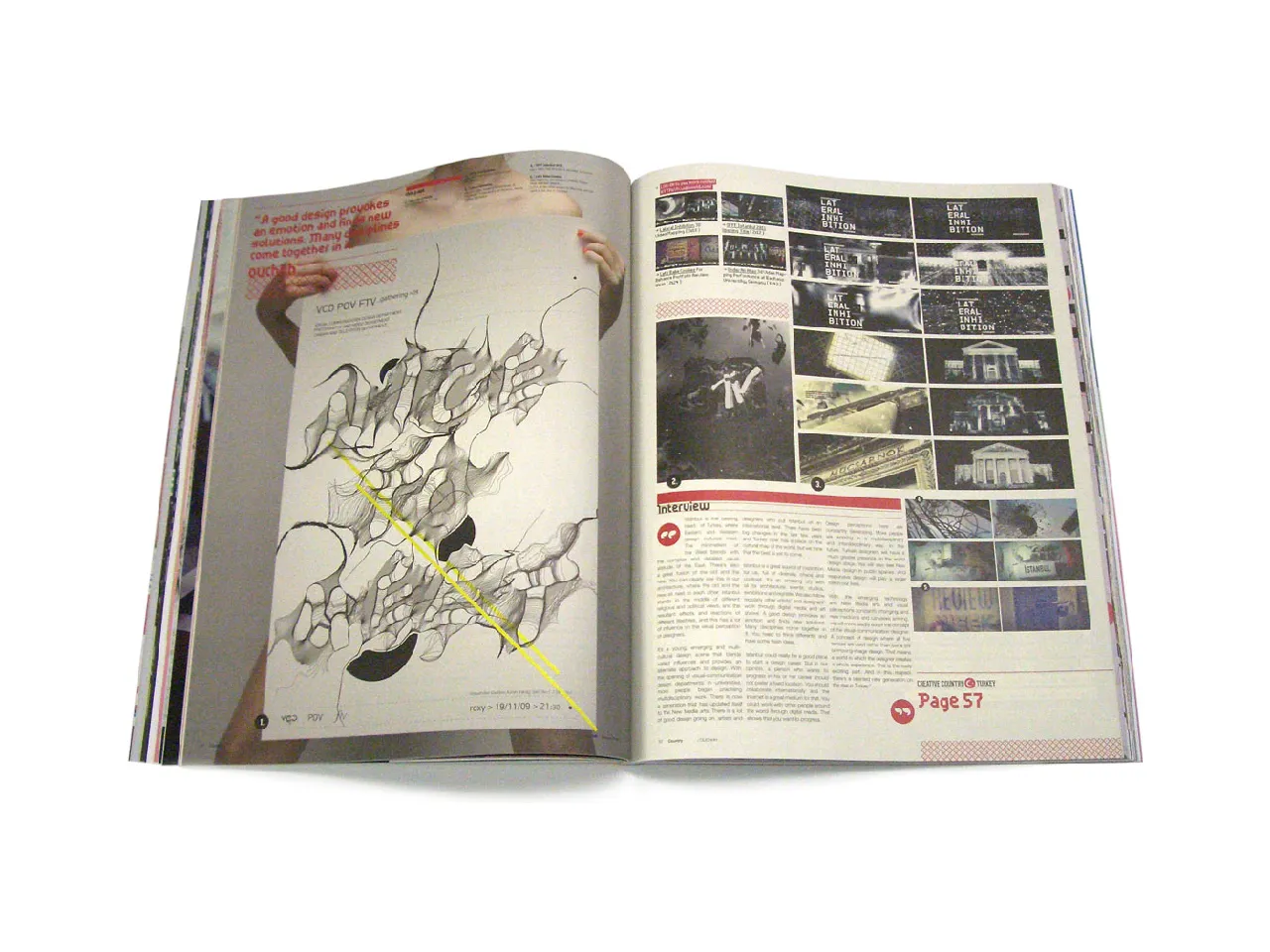
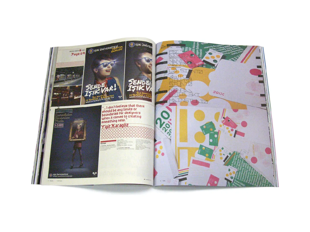
Creative Country: Turkey
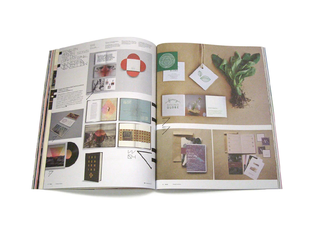
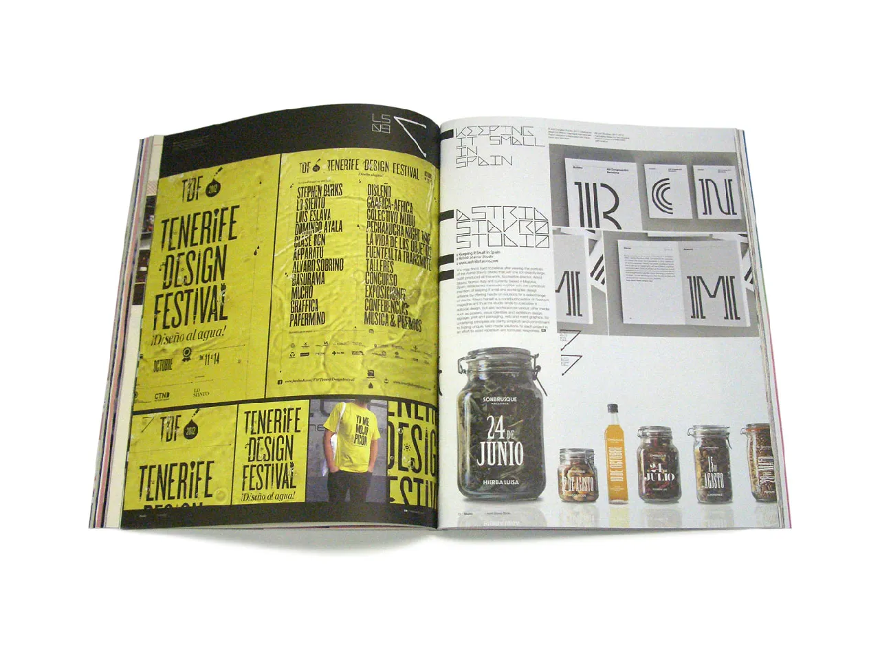
Studio: Innovative Europe
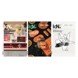
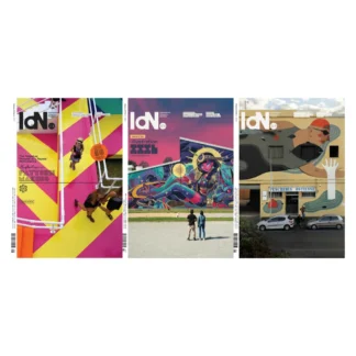
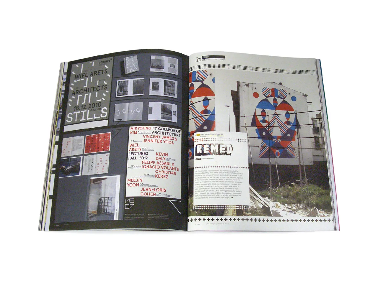
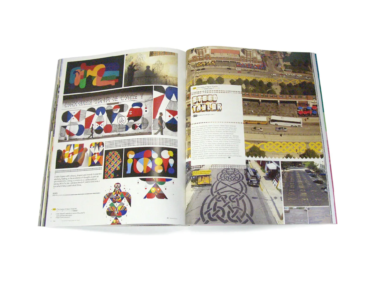
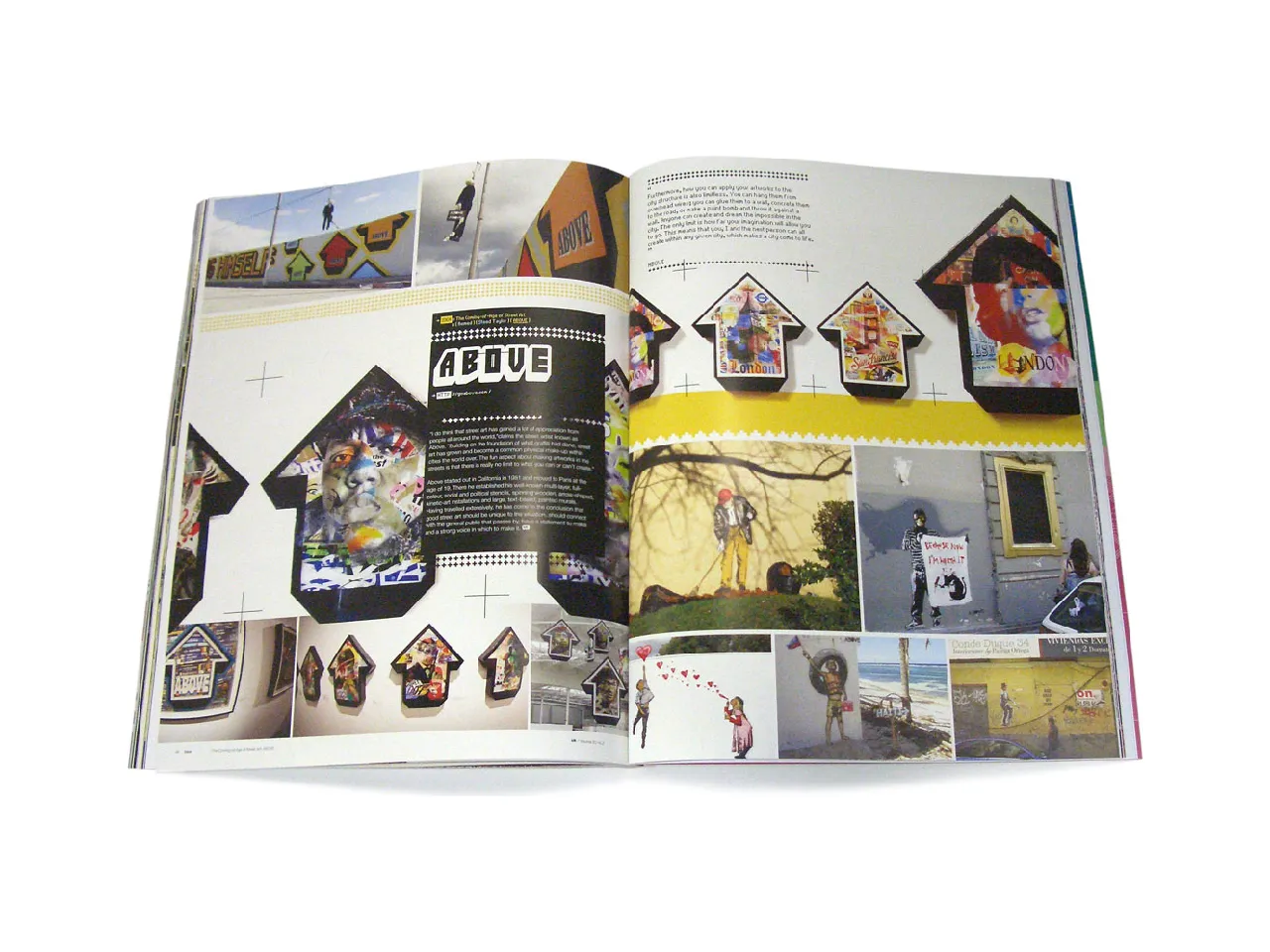
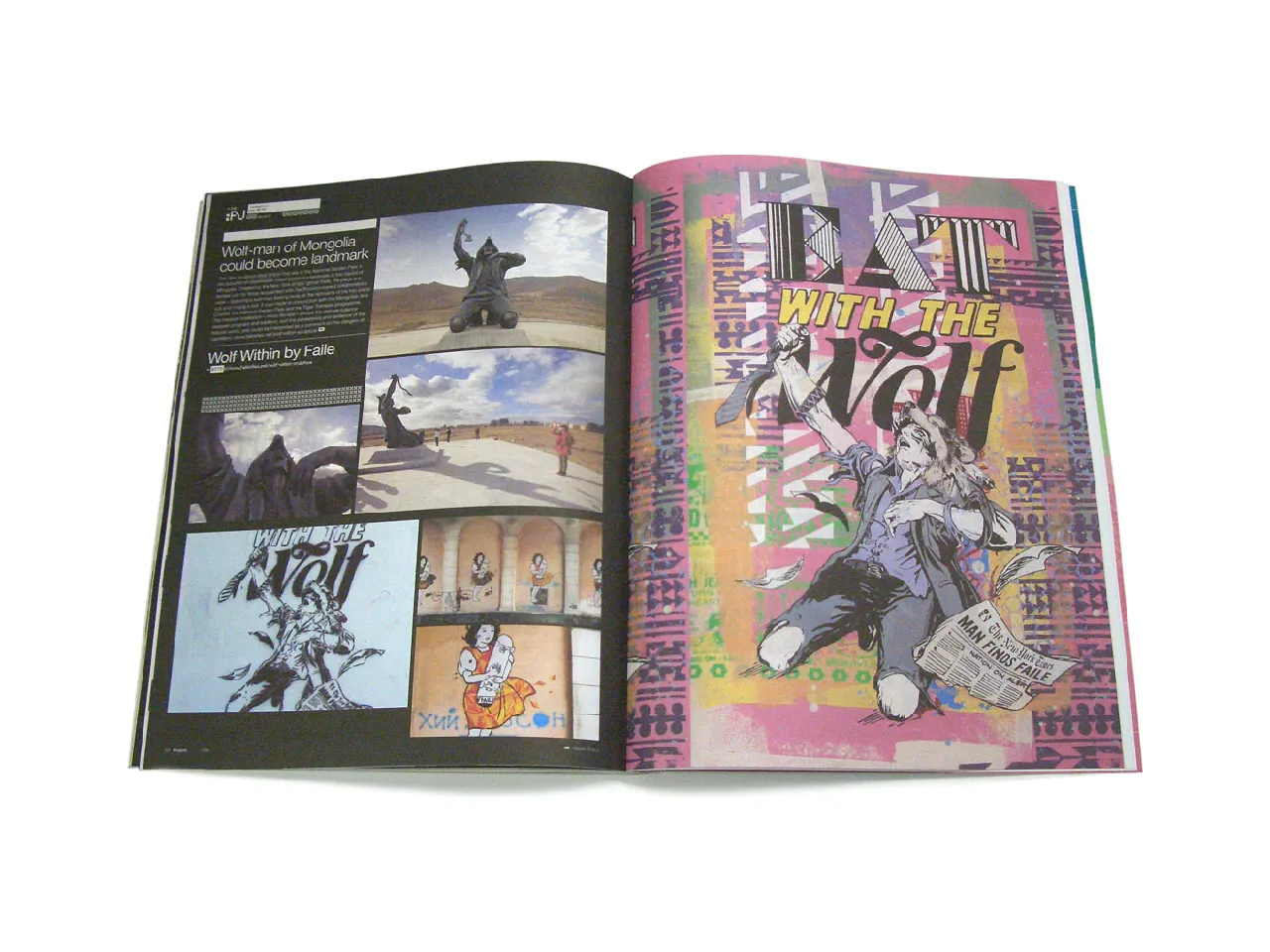
Idea: The Coming-of-Age of Street Art
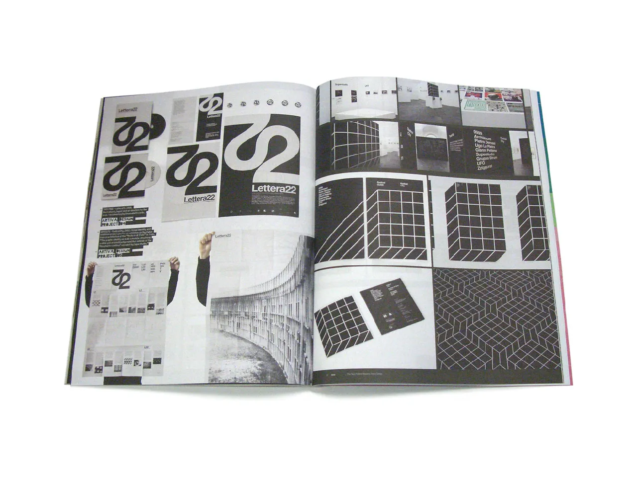
Idea: The New Pattern-Makers
Typography: A Single Typeface with Many Uses
Specifications:
108 pages
6 varying paper stocks
4C process + spot UV + vanish
Online access to tv.idnworld.com included