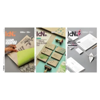
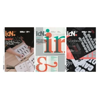
Description
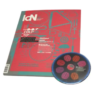
Mono-Graphics Issue
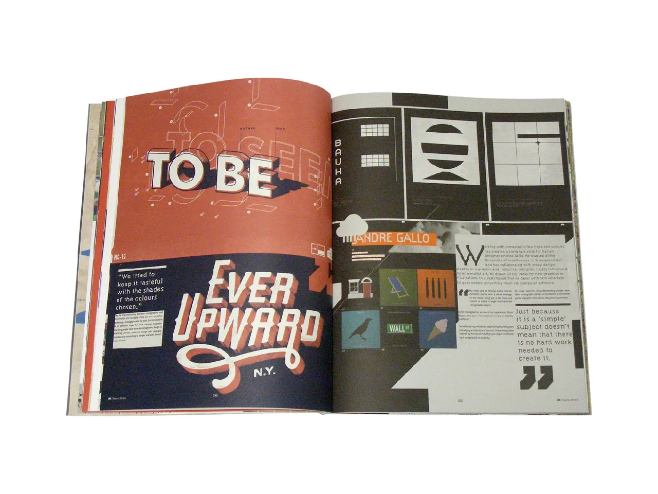
Neither “nostalgia” nor “minimalist”—though it has a lot in common with both styles—mono-graphic design is best defined by its attitude to colour, which is very much that of “less is more”. Utilising very few colours—sometimes even just one—it turns this apparent limitation into a virtue by concentrating more intensely on the design itself and the impact it can make with a reduced number of hues.
Stripping away the non-essentials and making what’s left work harder is never easy. There is always a temptation to go on adding and “improving”, despite the obvious risk that this entails of gilding the lily. Where mono-graphics are concerned, that option is just not available, so the designer is forced to become more resourceful, more efficient or simply cleverer.
Featuring:
Alexander Lis | Andre Gallo | Fifty And Fifty | Heath Killen | Hello Poster | Luke Insect Studio | Marius Roosendaal | Raw Color | Stephen Kelleher
Contents:
Motion Gallery: Infographics
Mono-Graphics: Speaking in a mono tone
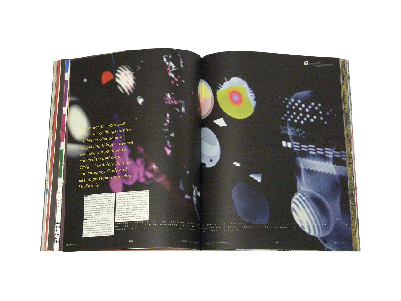
Creative City: Stockholm
Studio: Cody Haltom, IWant, Quadrado, The Consult, Unit Editions
Pick of the Month
Specifications:
102 pages
6 varying paper stocks
4C process + spot UV + vanish
110 minutes DVD Video included


