Description
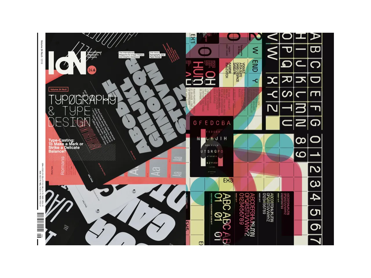
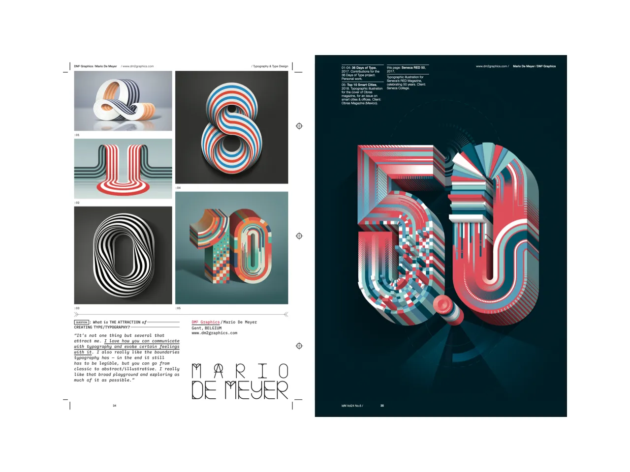
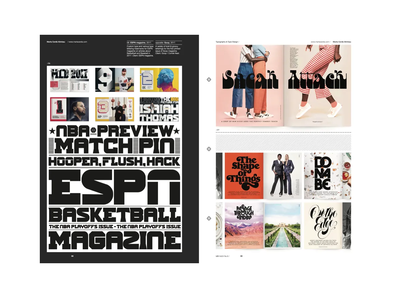
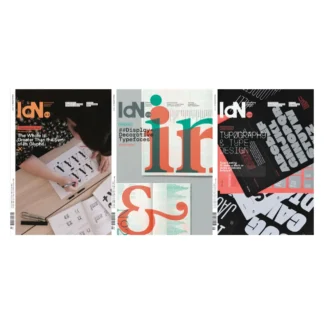
Typography & Type Design
When a graphic designer starts work on a project, one of the first decisions to be made is what kind of typeface to use. Hours can be spent rooting through the options until the right combination is arrived at—most often more than one.
And despite the literally thousands different type-sets available to us these days, there are still never enough to satisfy every designer’s needs. Hence the temptation for most of them to tailor-make their own.
Once a set of type interacts with other elements, it instantly changes its status to that of typography. This is the art and technique of arranging type to make written language legible, understandable and appealing when displayed.
Featuring:
Alex Frukta | Alfredo Marco Pradil/Hanken Design Co. | Ben Fearnley | bb-bureau | Benoît Challand | Charry Jeon/CFC | Cheolhong Kim | CREAM/Wes L. Cockx | Dima Abrakadabra | DM² Graphics/Mario De Meyer | DSORDER/Martí Serra | eltipo | Eps51 | Estudi Ramon Carreté | Fraktal Design Studio/Frkstudio | Heavyweight Digital Type Foundry | House Industries | HvD Fonts/Hannes von Döhren | Jules Tardy | Julien Gionis/StudioJugi | Coke | Lo Siento | Marcel Piekarski | Marina Glikman | Marta Cerdà Alimbau | MILTZ | mobstr | Mohamed Samir | Moshik Nadav Typography | Muokkaa Studio | My Name is Wendy | Non-Format | Official Classic (OFCL) | Particle/Gao Yang | Philippe Nicolas | Pokras Lampas | Rafa Goicoechea | Raquel Peixoto | Ryan Atkinson | Setup/Ondrej Jób | Shun Sasaki/Ayond | SPIN | Syddharth/Siddharth Mate | The Northern Block | Thinking*Room | Vladimir Egoshin/Typemate | Village
Specifications:
160p + 8p cover
160mm (w) x 230mm (h)
4 varying paper stocks
4C process + matt lamination
ISSN (English Edition): 1029 4805
ISSN (Chinese Edition): 1029 4813


